Your Personal Guide of Rochester

Overview

In these recent years, the City of Rochester has been renovating the downtown area. They were hoping this would  will encourage more people to come down to the city. This project focus was to figure out others way encourage people to visit the city.

Timeline
5 weeks
Software
Figma
Illustrator
Role
Researcher
UX/UI
View Process Deck
hero image of the project

Rochester is a city with a rich and often overlooked history, including the surprising fact that it once operated the smallest subway system in the country.

But many of interesting stories are hard to find.

The City of Rochester could place greater emphasis on showcasing its unique stories and history.

These project started as way for me try to connect with Rochester. I’ve lived here for four years but barely know anything about the city.

The Problem
How can we make it more easy and interesting for people to learn and experience the city of Rochester?
Goals for the Project
Discoverability  
- Make it easier for more people to find interesting location.
Immersive
- Find a new way to teach the history of Rochester.
Rewarding
- Make it more rewarding come down and learn about the city.
The Solution
Explore Rochester Easily with RoamRoc
RoamRoc is an app designed to make exploring Rochester exciting and effortless. The app focused on creating an engaging experience that encourages users to return, discover more, and immerse themselves in the downtown. With its unique features, RoamRoc offers a fun and enjoyable way to experience everything Rochester has to offer.
Effortless Exploration
A personalized feed tailored to the user's interests. Use filters and tags to find exactly what you're looking for. Use the map feature to quickly find exactly what you're looking for.
Engaging Learning With AR
Discover all the information you need about a location. Use the AR feature to explore the history of the location.
Reward Learning
Earn badges for visiting locations.If sign up, the app will keep your progress of exploring the city. There will challenges every month to encourage to learn more about the city.
Check My Design Process and Thinking
User Interview
Breaking Down the Problems
I conducted user interviews with 3 Rochester resident to understand the view point on a different experiences that draw them to city like audio tour,  there goals when visiting the city, and what keeps them coming back to downtown.
Use an affinity mapping to organize notes and  quotes from the interviews.  
The patterns I found in my research interview that guide my design:
I always enjoy site seeing and  learning new pocket of information about an area or building but getting that information can be inconvenient.
Learning the story of the city is something that they see a lot value when visiting a new area. As it makes the area more meaningful and help them connect with the city. But some view the typical historical plaques about the area as boring and long.
I hesitate to use a city audio tour because I want to explore the city in my own pace and I also won't  enjoy wearing headphone.
They all view in person or digital audio tour has something that could make experience worse. They feel they won't enjoy being tided down with a long multiple stop tour. Would like to be more independent with exploring the city.
From This,The Main Insight I found
Rethink the Idea of City Audio Tour to Make them more Accessible for Use Cases
1. Headphone-Free & Flexible
Many disliked using headphones while exploring. And also felt that the pacing of tours are too rigid, they are either too fast or too slow.
2. New Direction
Focus on highlighting key city spots with clear navigation. Make learning about the city more engaging and interactive.
3. Making Learning Fun
Use AR features to bring history to life with visual overlays. Making exploring rewarding to encourage visitors to come back to the city.
User Persona
Uses my Research, I created two persona base on the age of the users
I selected the personas' age range to be between 26 and 40 because previous research shows that this demographic is the most likely to seek out and try these types of experiences.
Bringing the Solution to Reality
An interactive Application that Encourage Learning and Discovering about the City of Rochester  
My solution focus on creating a simple experience that make finding these interesting stories of the city easier. The experience will be using the smartphone as it is a common device to have when traveling.  This is providing more than just finding these locations like Google but also gives a depth history in how is it significant for the city.
Prototyping Different Solutions
Using Figma, I Designed Multiple Iterations of my Product
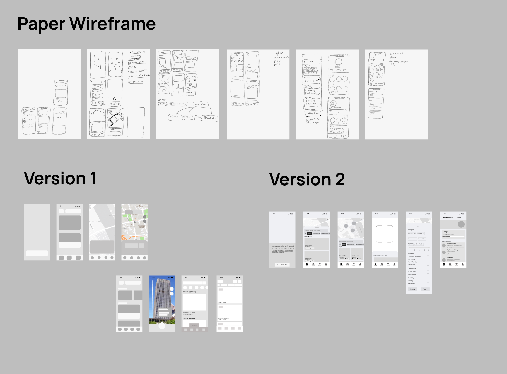
I began by brainstorming layout ideas and sketching them on paper. Once I had enough concepts, I created a low-fidelity wireframe to map out all the elements within the iPhone frame. Next, I moved to the high-fidelity wireframe, adding the necessary text and icons. I went through two iterations, refining element spacing and incorporating rounded corners for a polished design.
Improving Design with Users Feedback
After getting feedback from users, an insight was to improve the hierarchy of the elements and tighten up the spacing. I also decided to combined the explore page and map feature to make the flow seamless. Add more options to the filter for better accessibly, that all users can easily explore the city.
Making AR More User friendly
For many users, this will be there first time using AR features. So I put safely warning messages to be careful when using AR. I also made a short tutorial in how use the AR feature to made to better improve the user expierences.
Creating the Branding
Aligning the Design with Existing Style of the City
I decided to go with blue color Palette as I want the project to be an associated with the city of Rochester, which using a blue flower as their logo and branding. Also Rochester is known for the river ,so I want add image and color of the river to the branding. TT Commons Pro is a great geometric font that is sleek and modern without sacrificing  readability.
Simplify the feature with Illustrations
As part of the branding, I design 3 simple illustration that were on Illustrator. They were made for the onboarding to better explain and guide the user through the experience.

The Final Prototype

Project Takeaway
Focus on User-Centered Design
I learned to conduct and understand data from user interviews to explore different users cases
Balancing Time Across Feature
Spending too much time on the initial screens left less time to refine later features. Managing time effectively is key to making sure every part of the app is polished
Focus on Visual Communication
Adding illustrations to the onboarding process made the features more intuitive for new users, showing the value of visual aids
Hey, you made it to the end!
Thank you for  taking a look at my case study